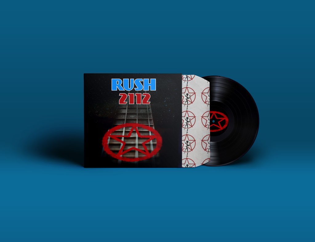
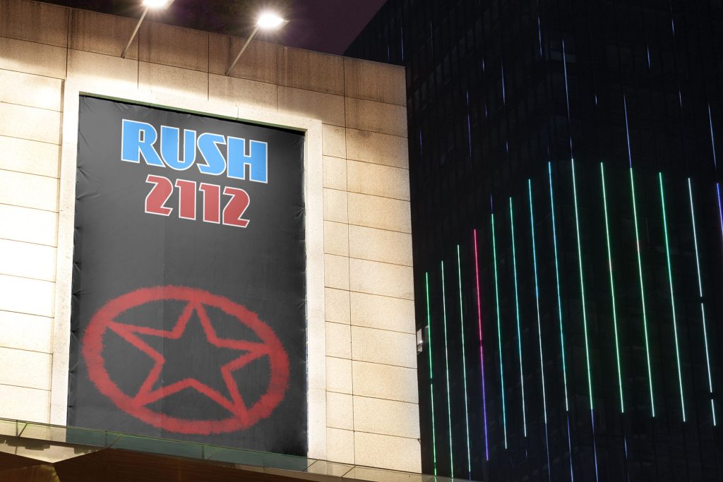

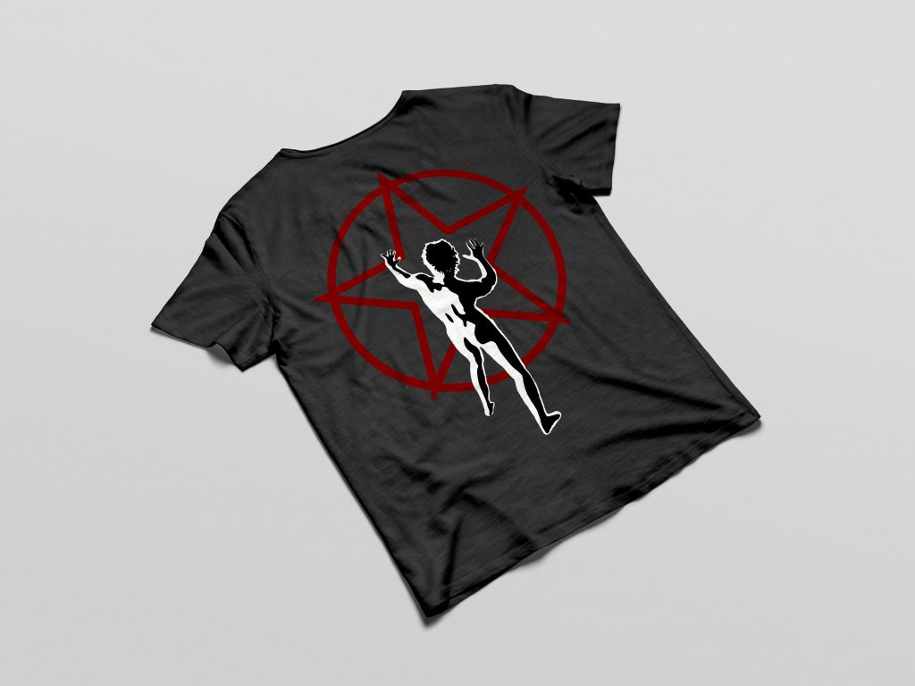
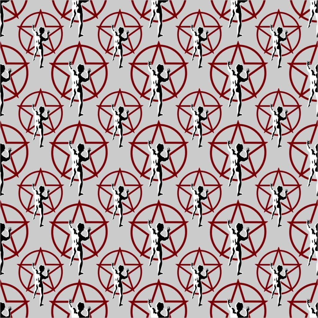
Created as an exercise in product redesign, I attempted to update the design of Rush’s iconic album 2112. I also experimented with digital mockups to see how the design would function in different formats.
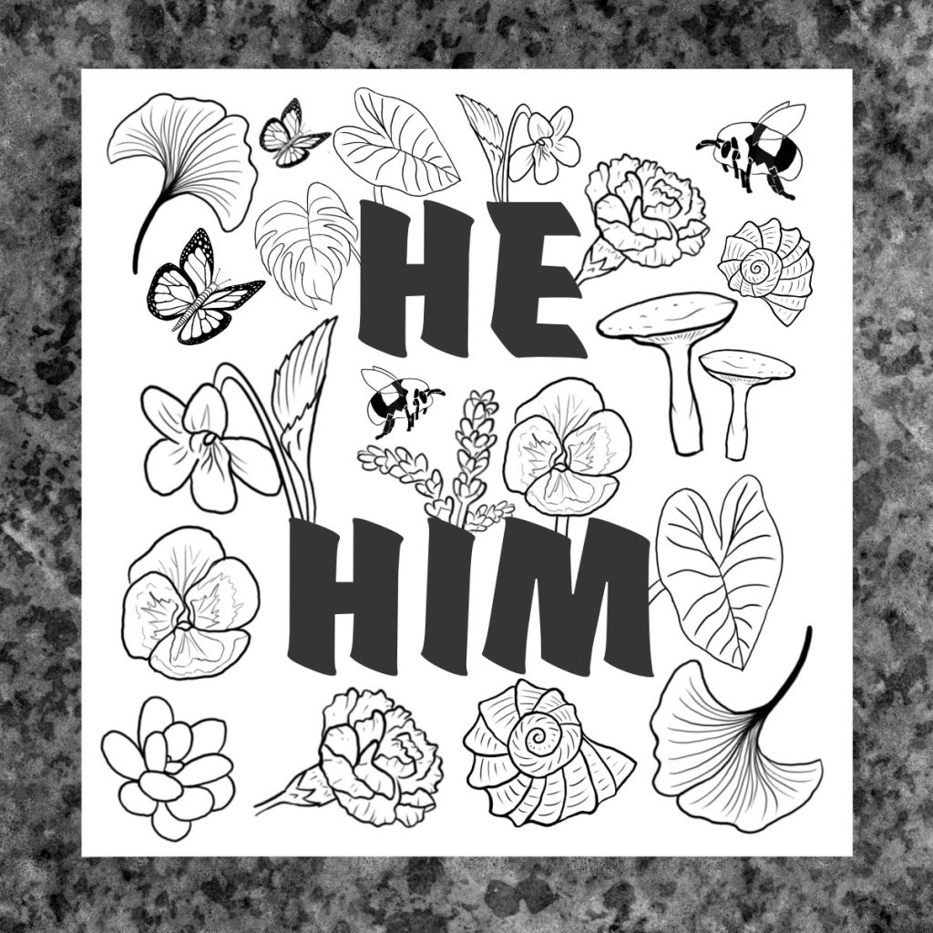
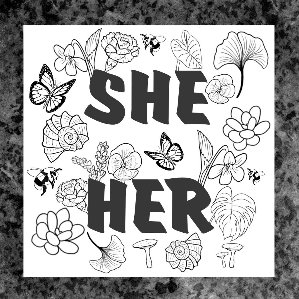
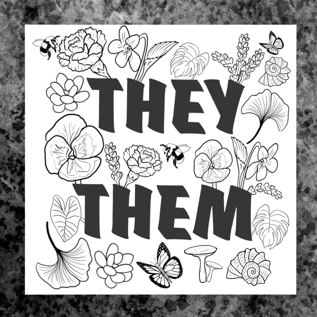
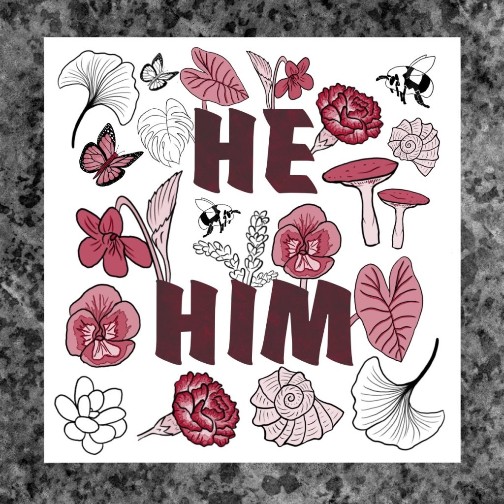
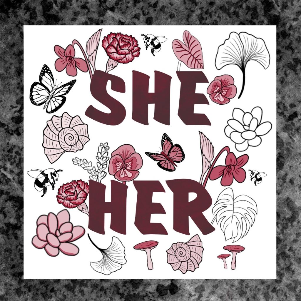
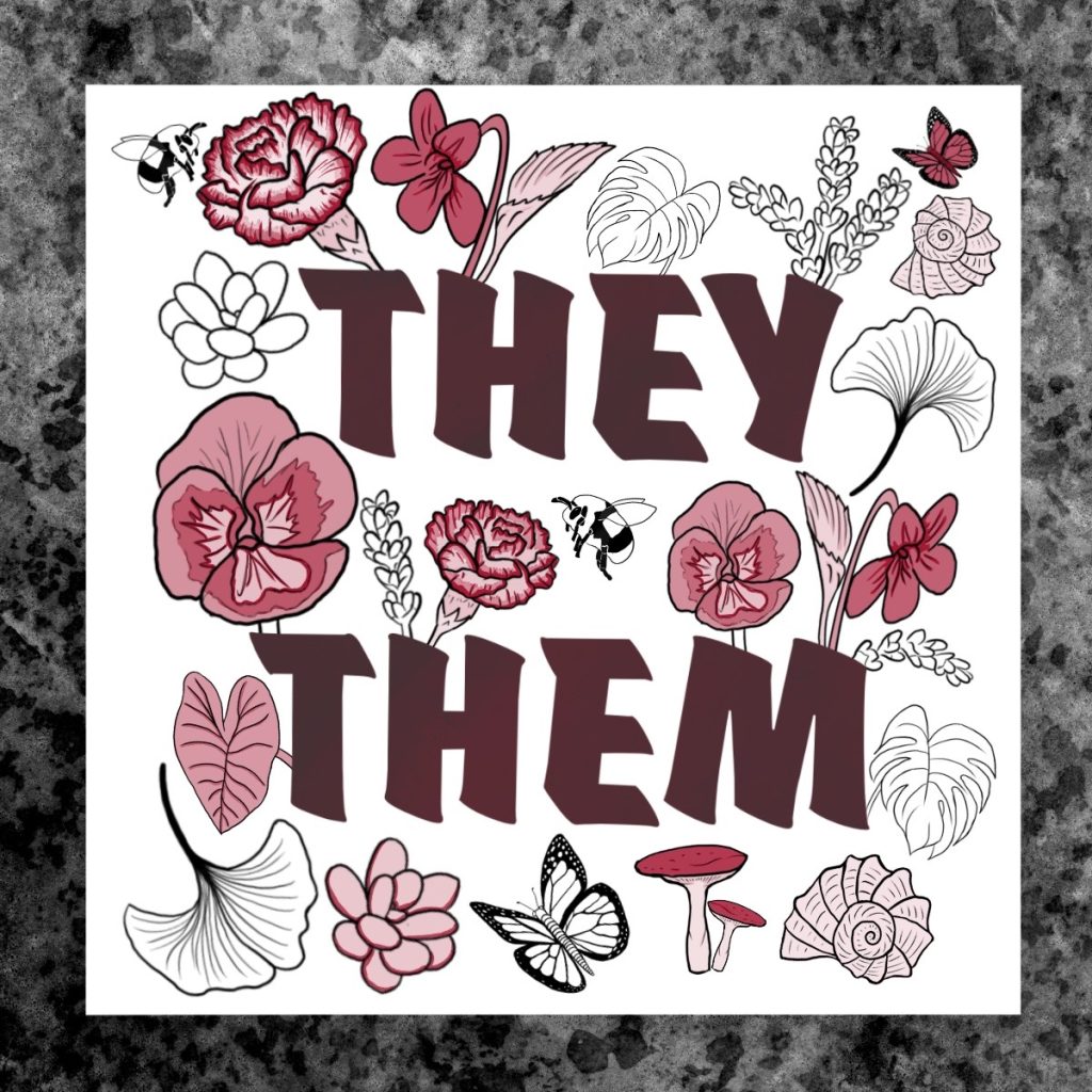
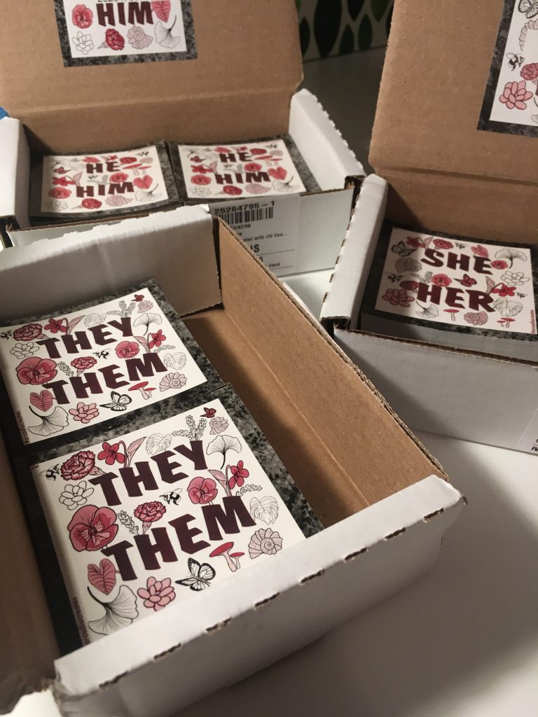
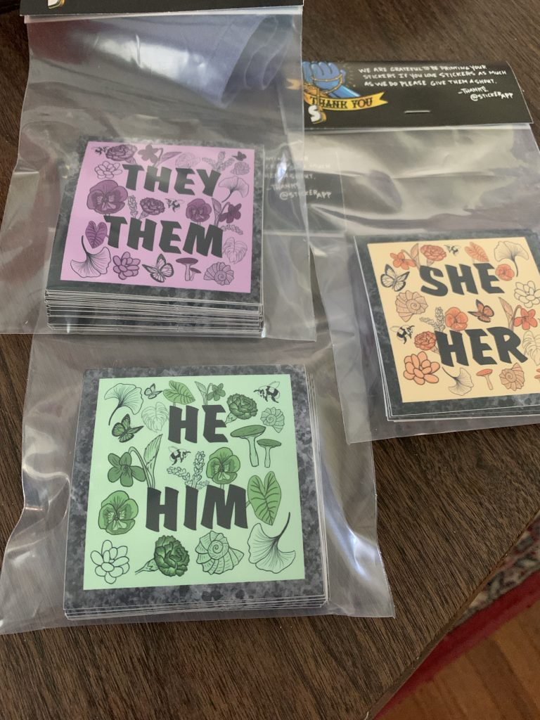
I created these stickers with the intent of incorporating botanical elements that both interest me, and have traditionally been associated with the queer community such as green carnations and violets. I also wanted to use colors that did not have a gender role typically associated with them to avoid alienating anyone.
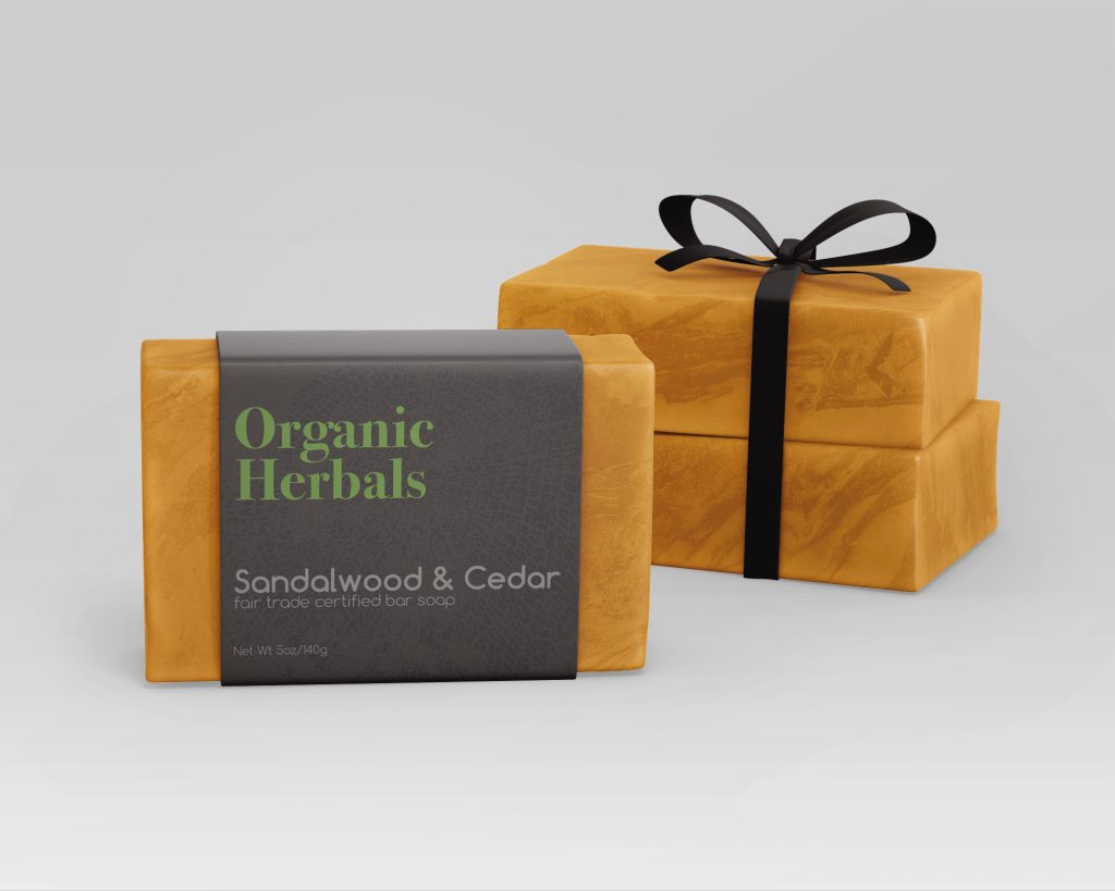
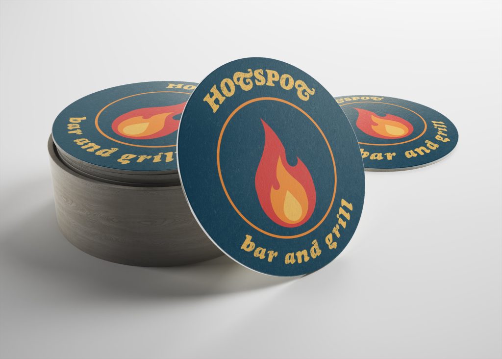
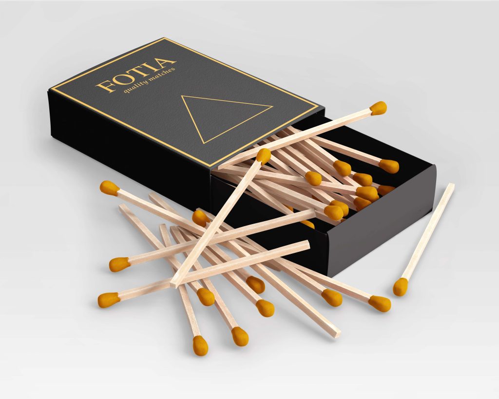
These three products were an exercise in creating brands and packaging to use with high fidelity digital mockups.
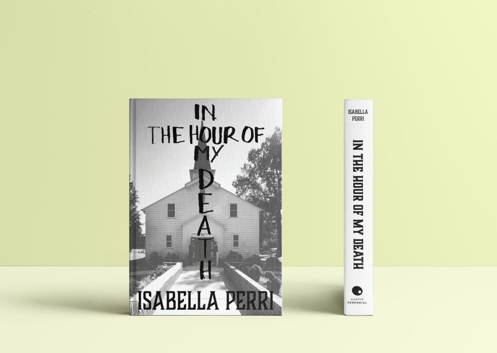

Working with a creative writing MFA student, I interpreted the summary of their thesis project in order to create a realistic book cover they could utilize.